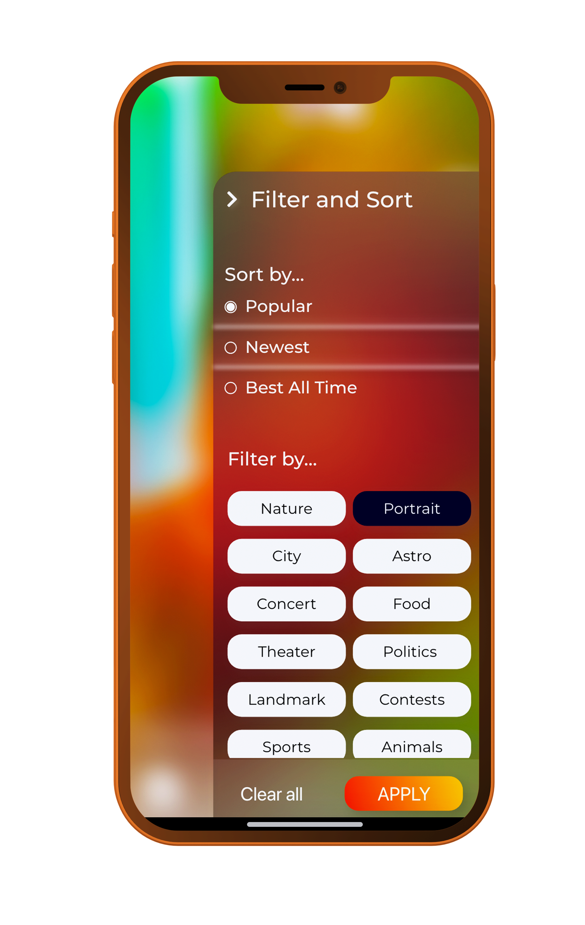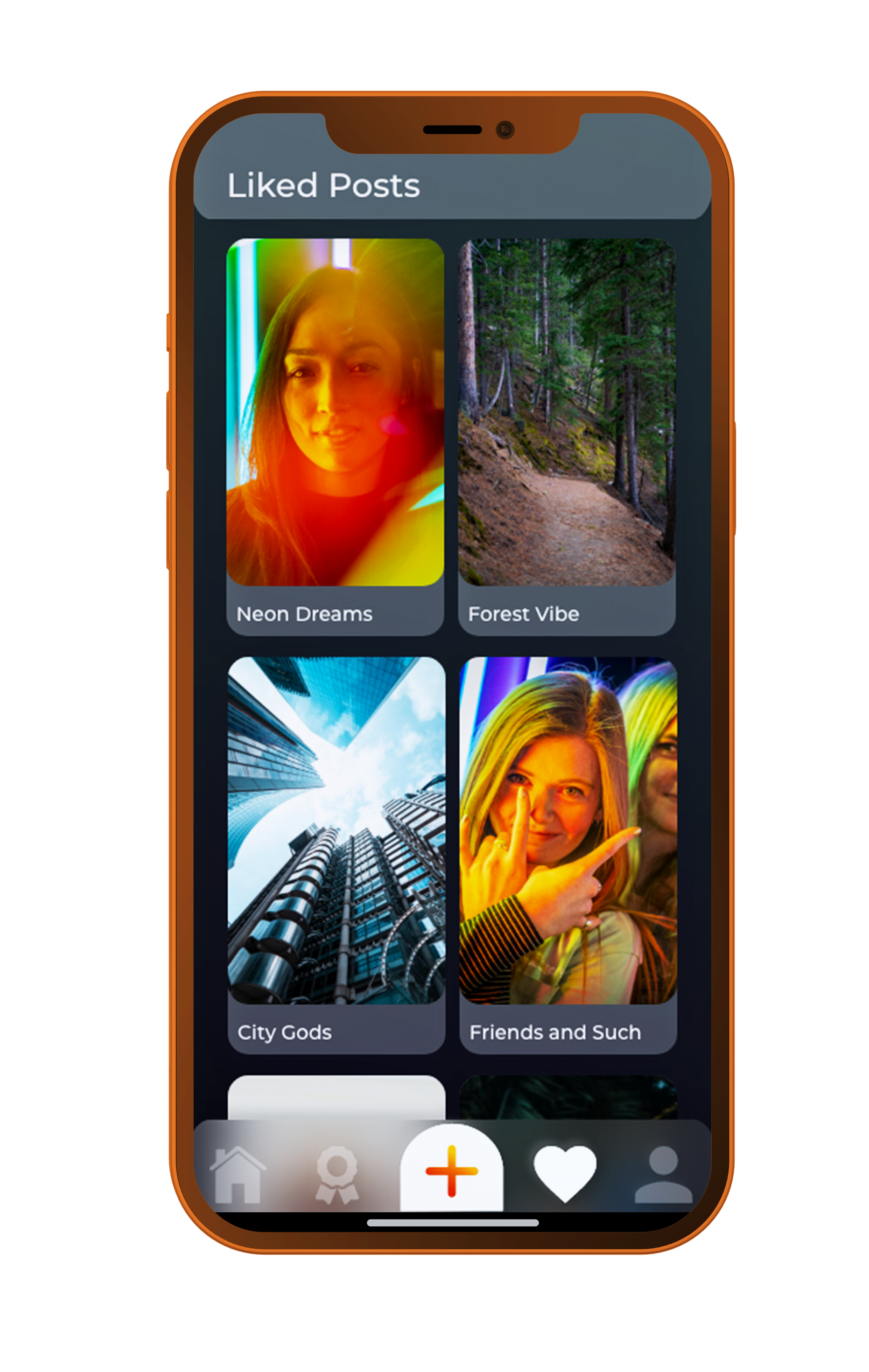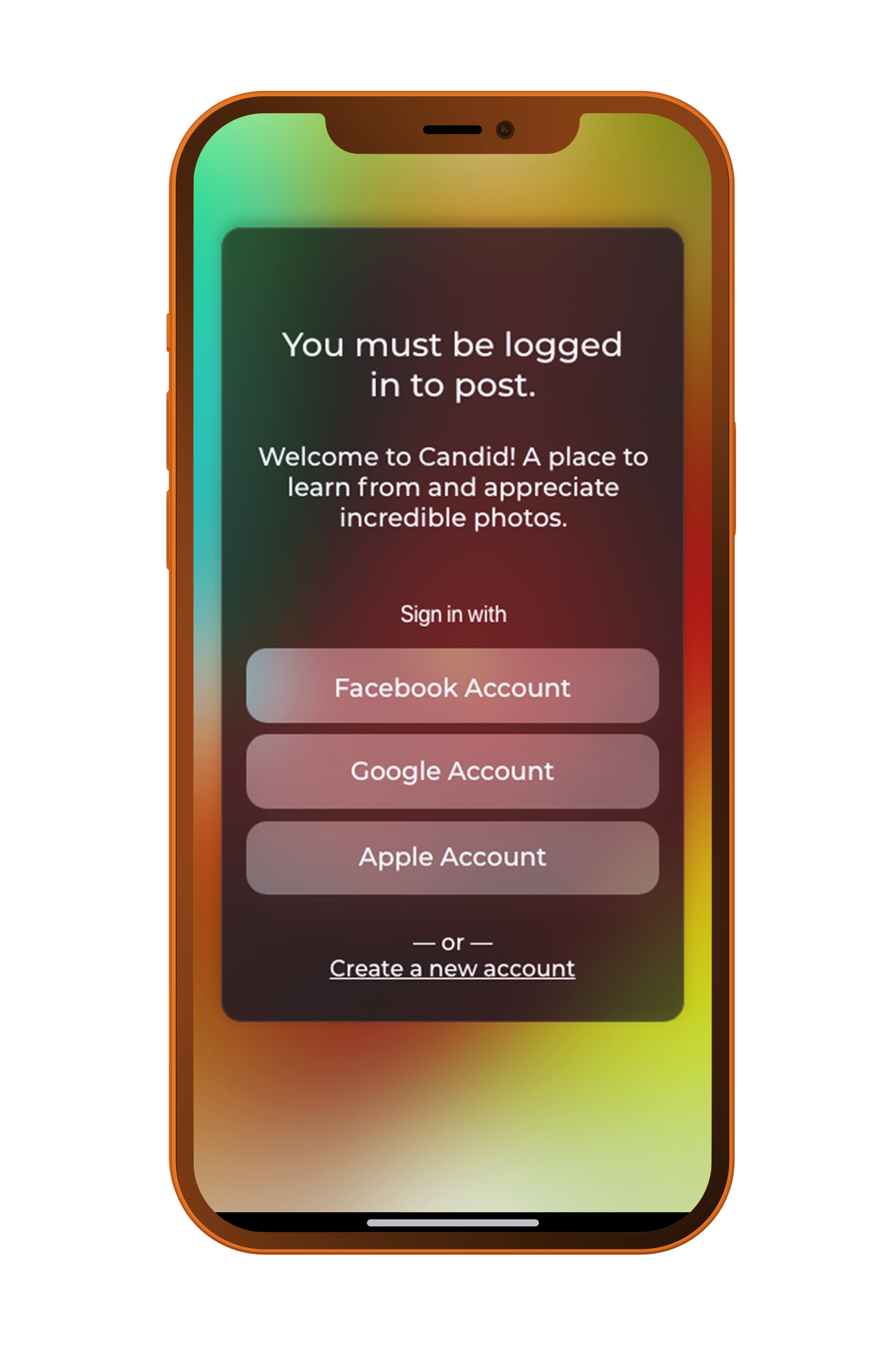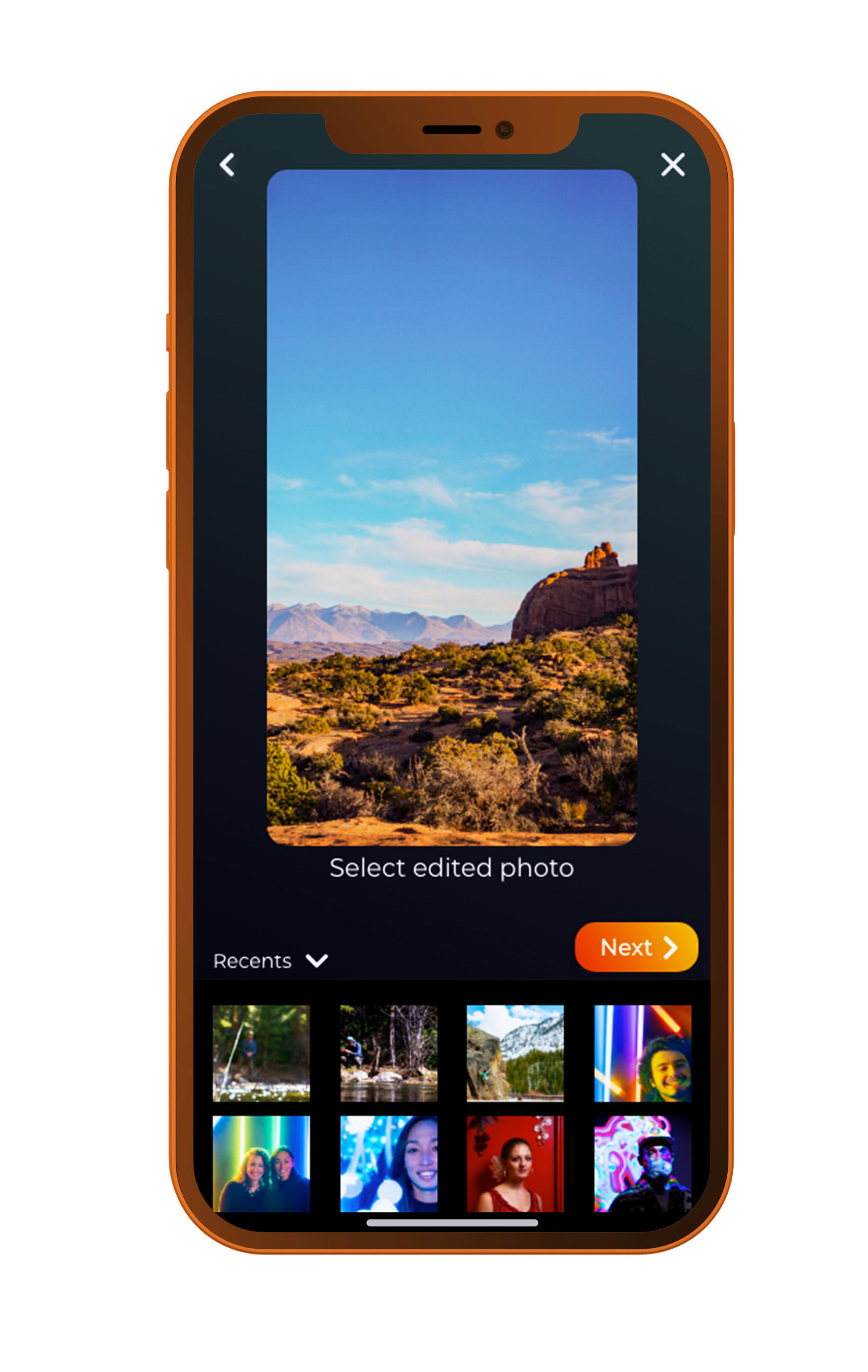
Candid App Design
Concept
You’re scrolling Instagram and see photo after photo that takes your breath away. As a novice photographer these seem impossible to get. Instead of feeling defeated, download Candid and learn what it takes to get these gorgeous photos.
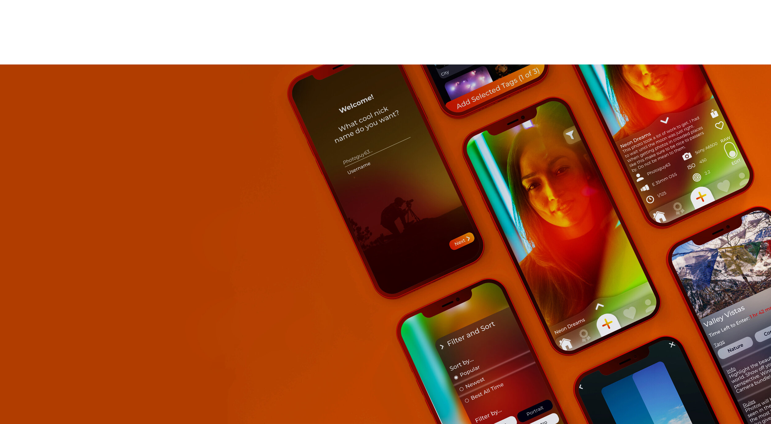
This project centered around creating an interface with strong brand identity while not lowering usability.
Role
UX / UI Designer
Duration
3 Week Sprint

How might we create an app to post, appreciate, and learn from incredible photographs? All while remaining inviting to both novices and experts.
Iterations
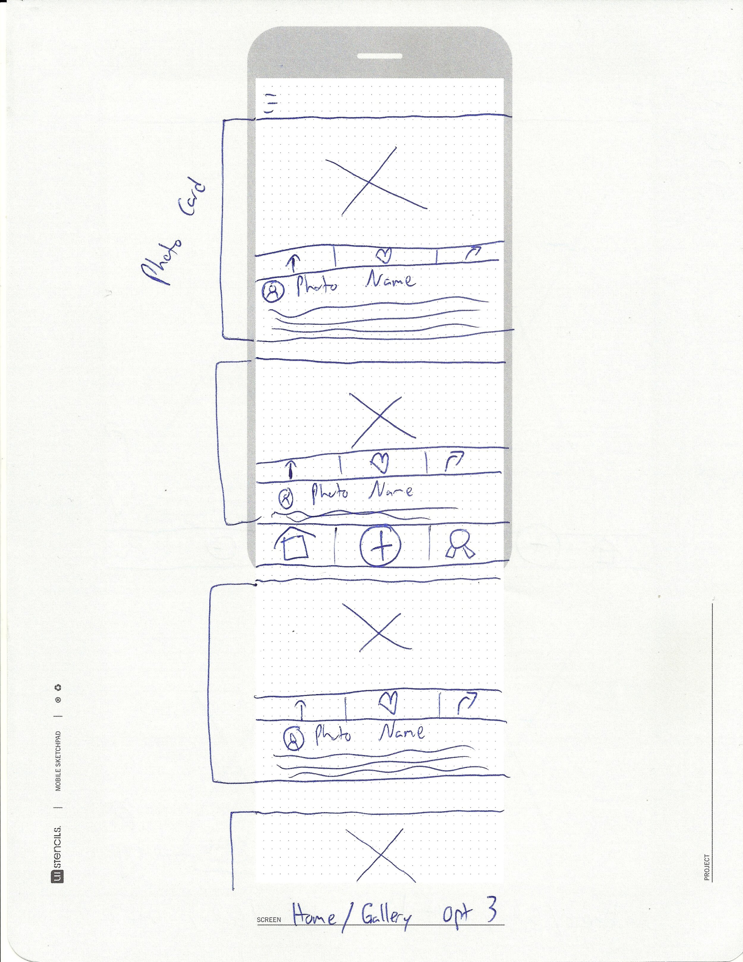
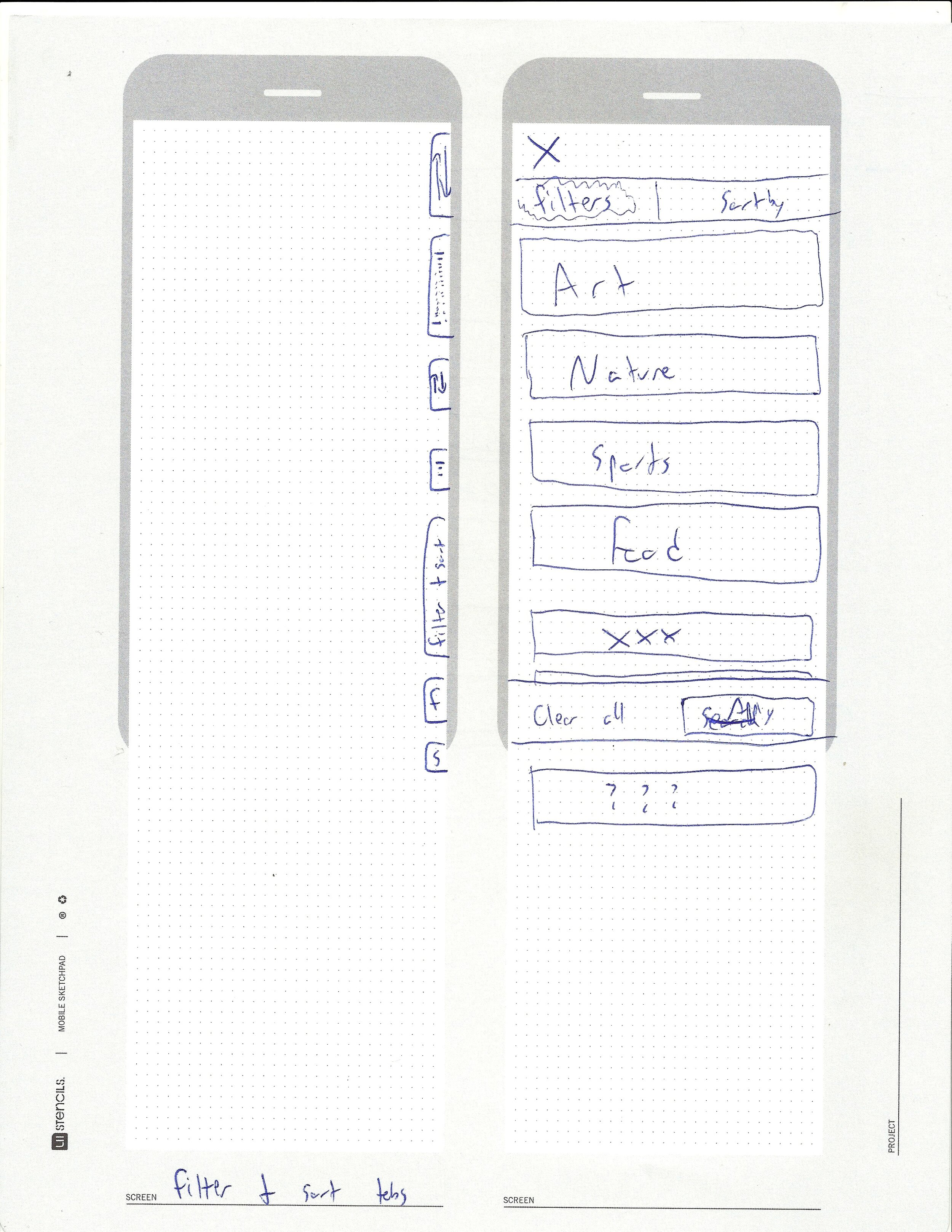
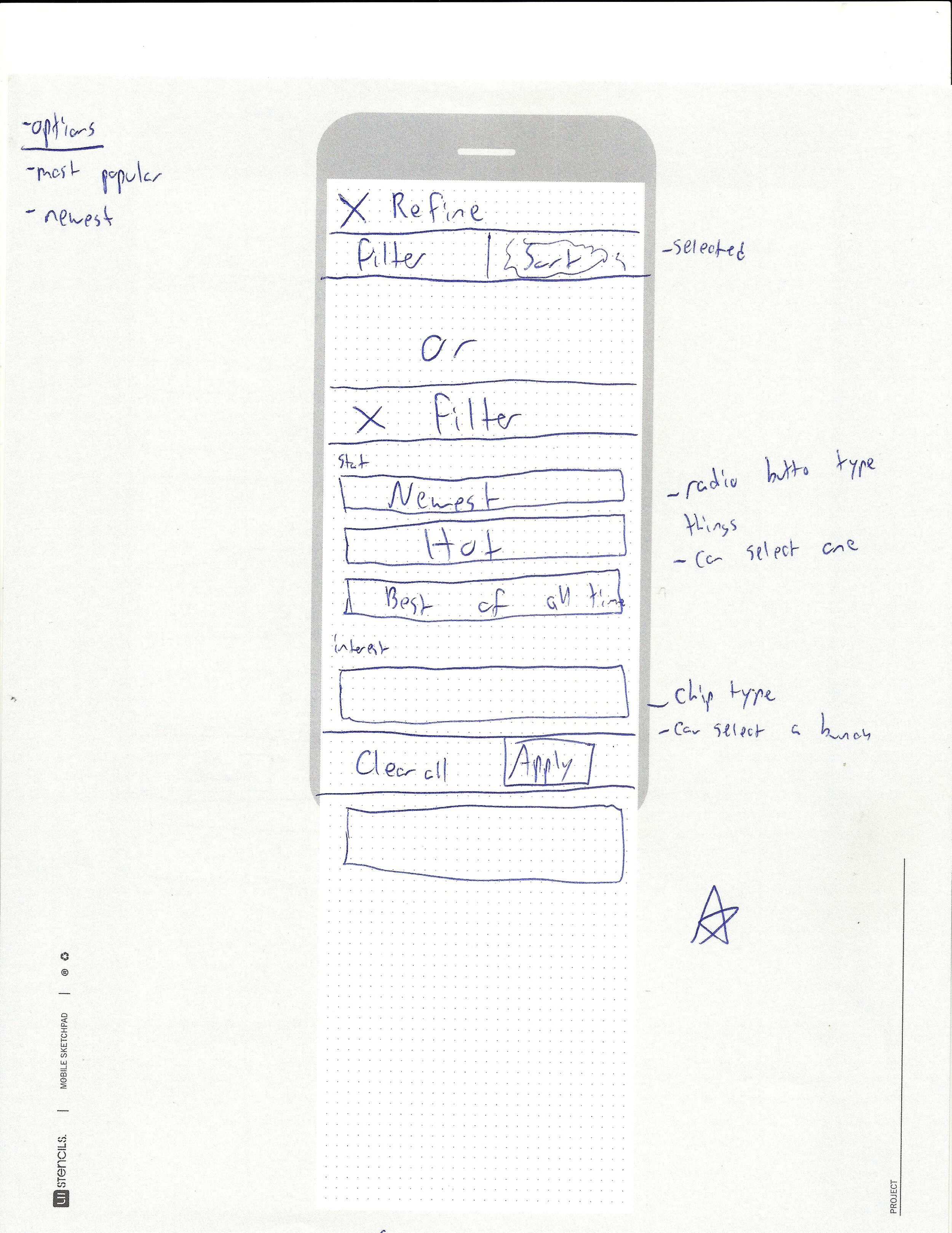
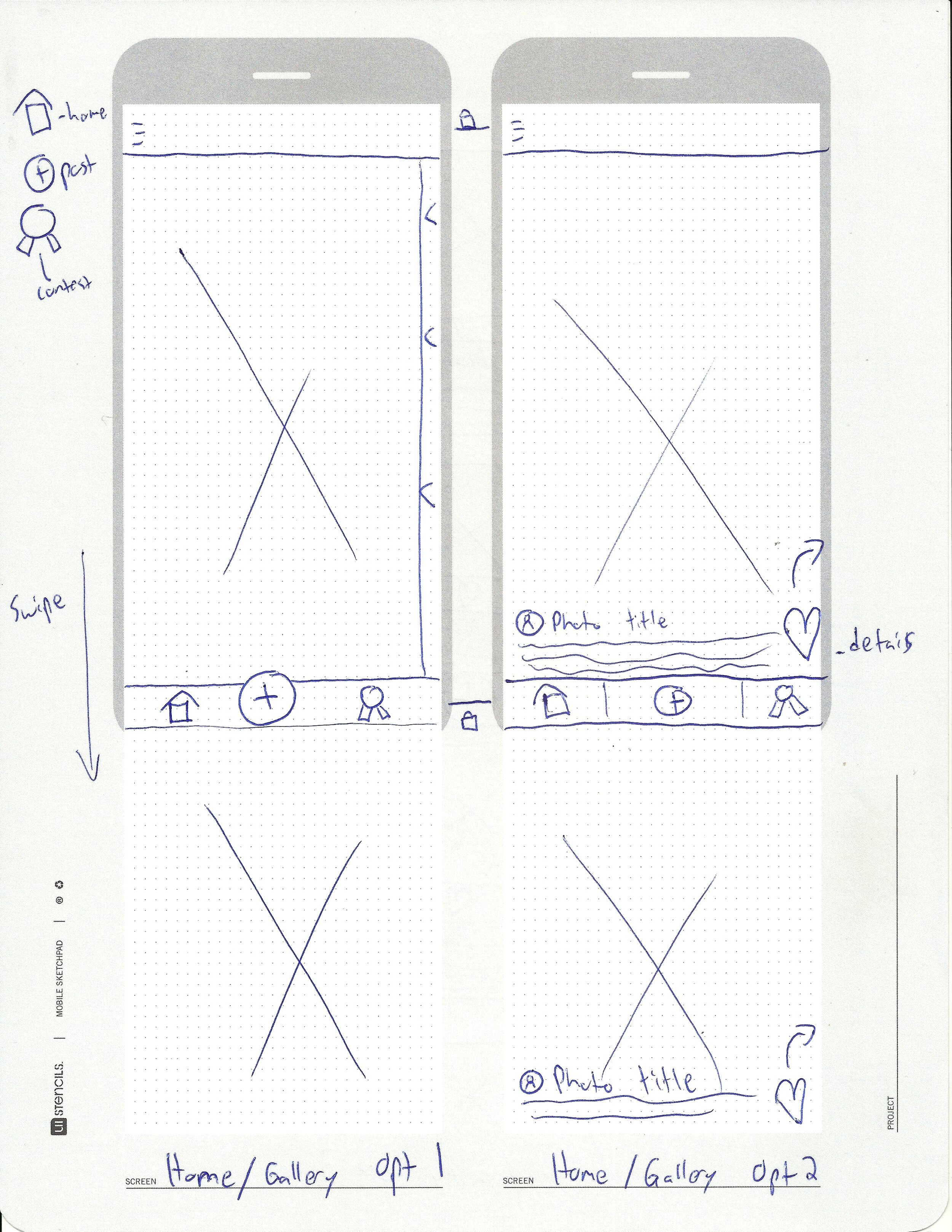
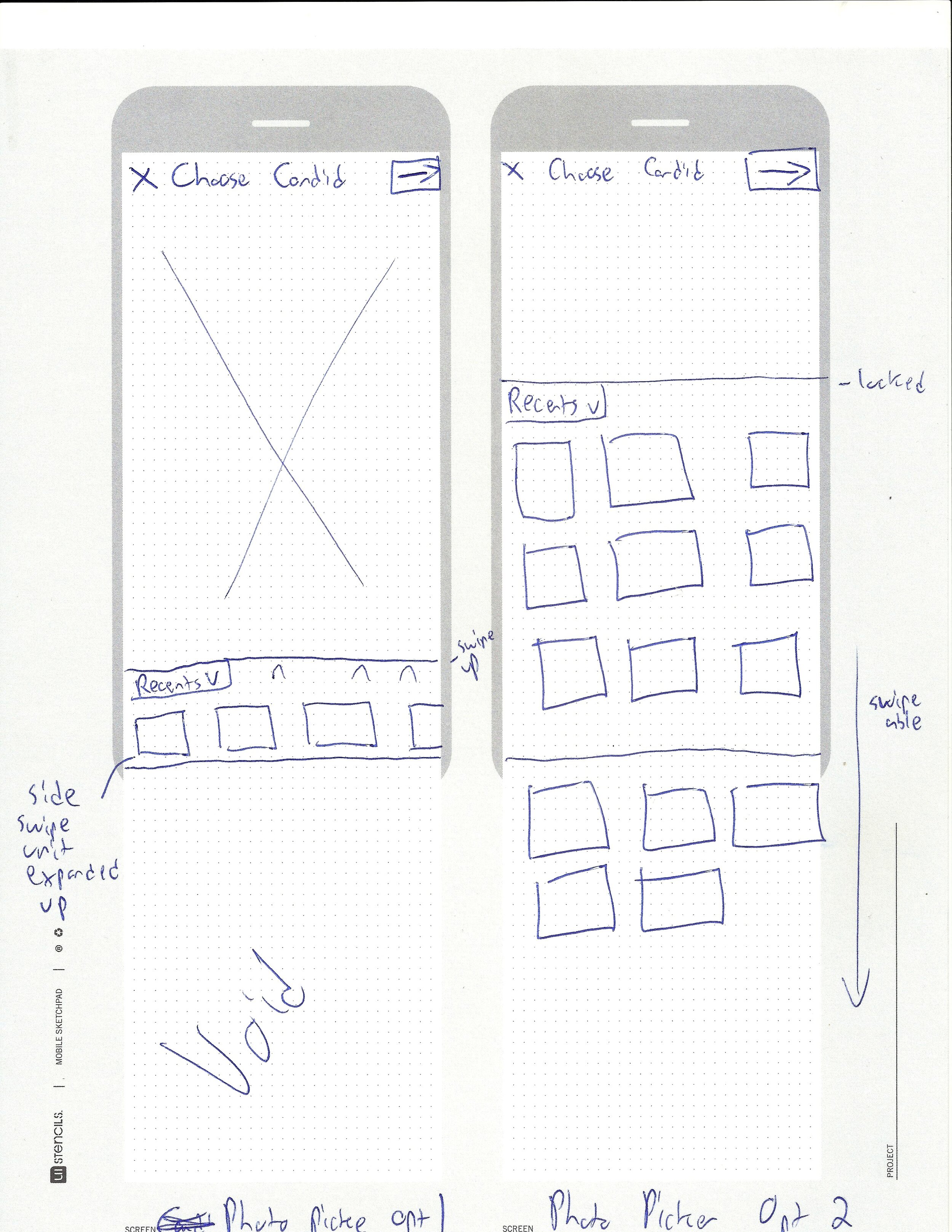
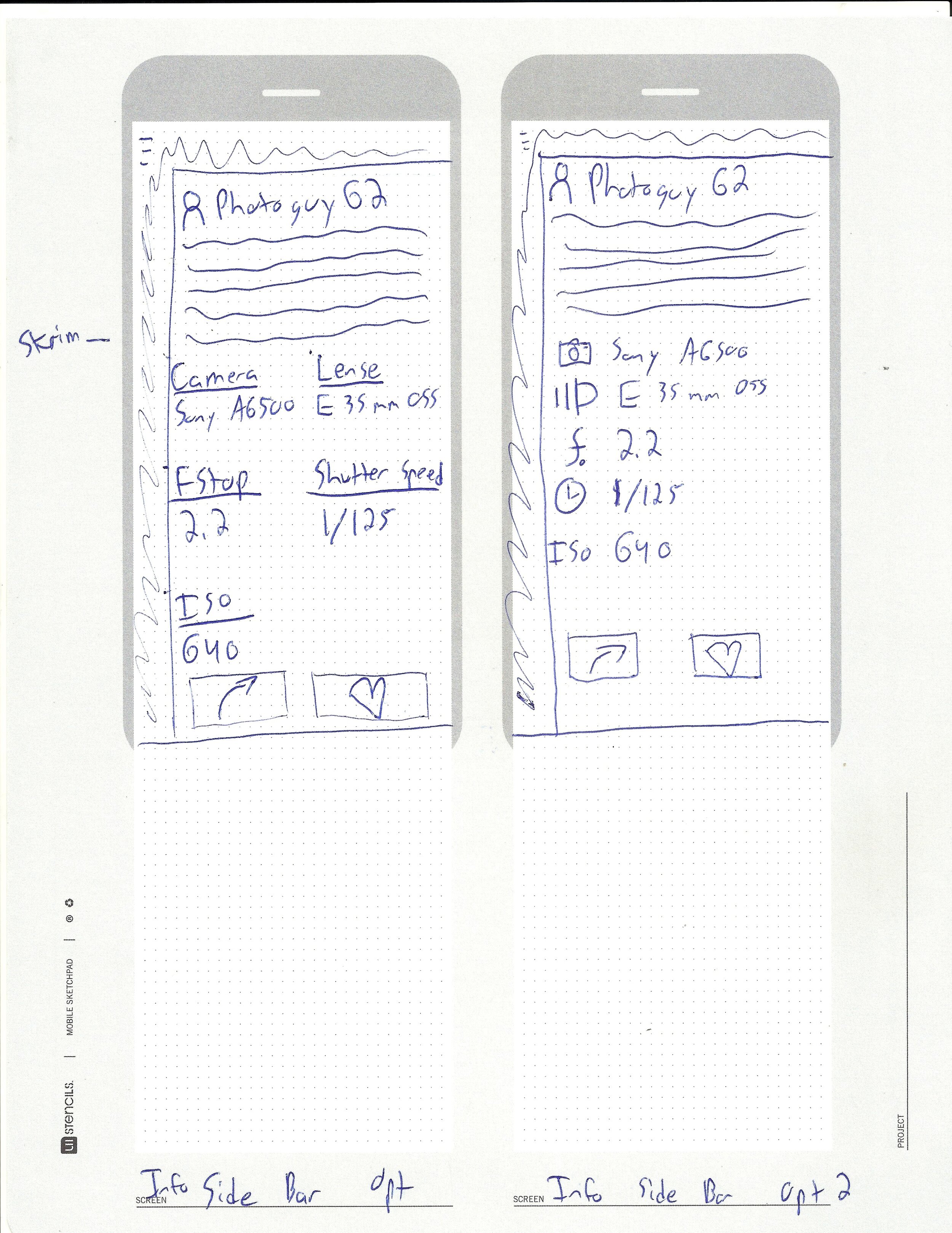
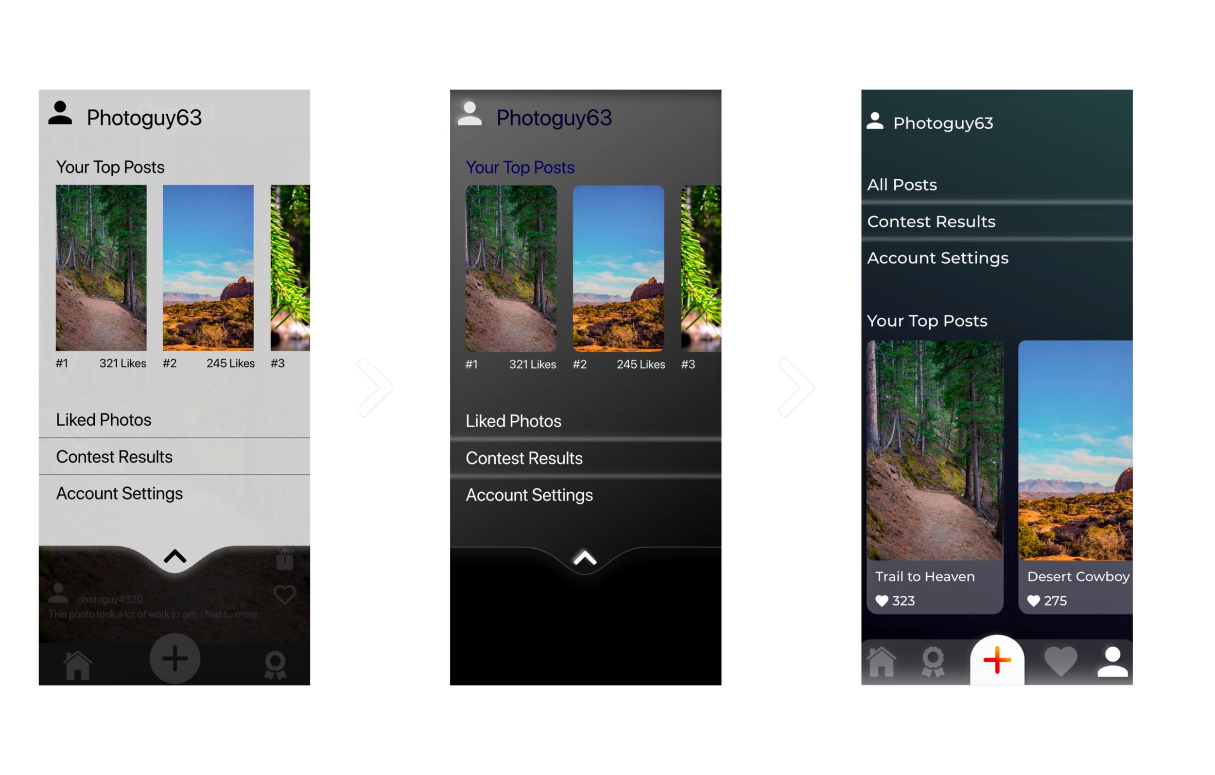
Prioritization of photo details + RAW photo viewing + contests =

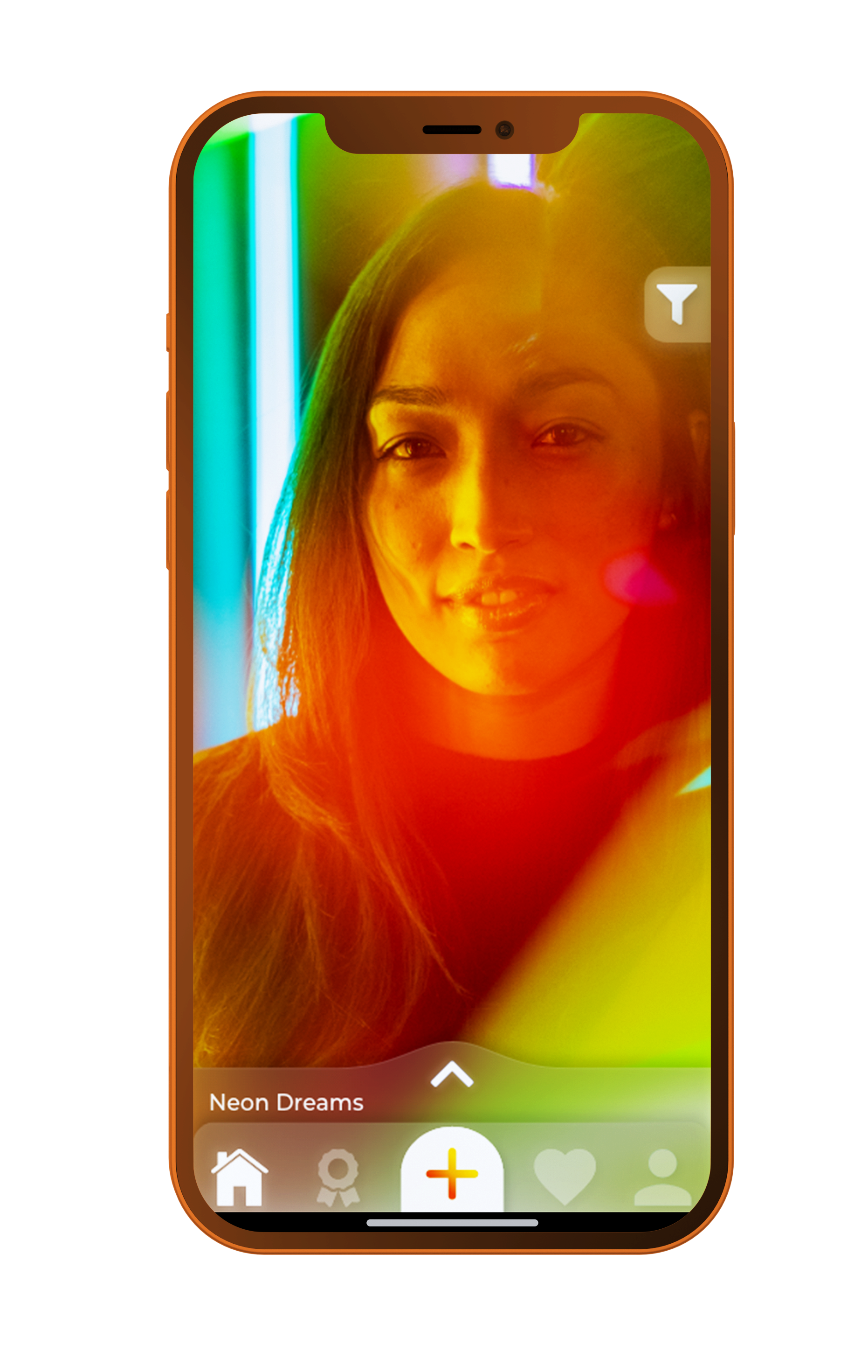
Landing Page
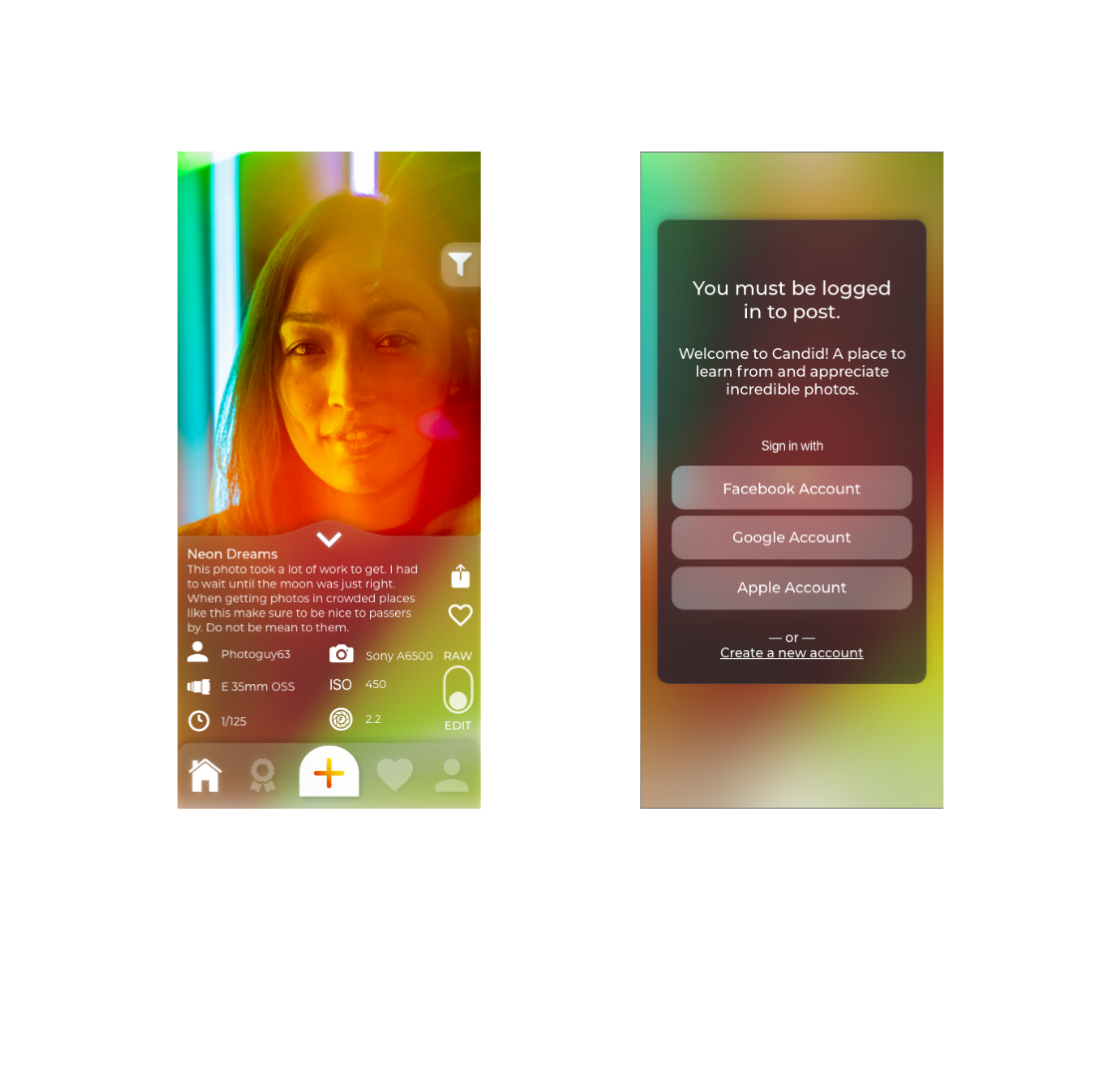
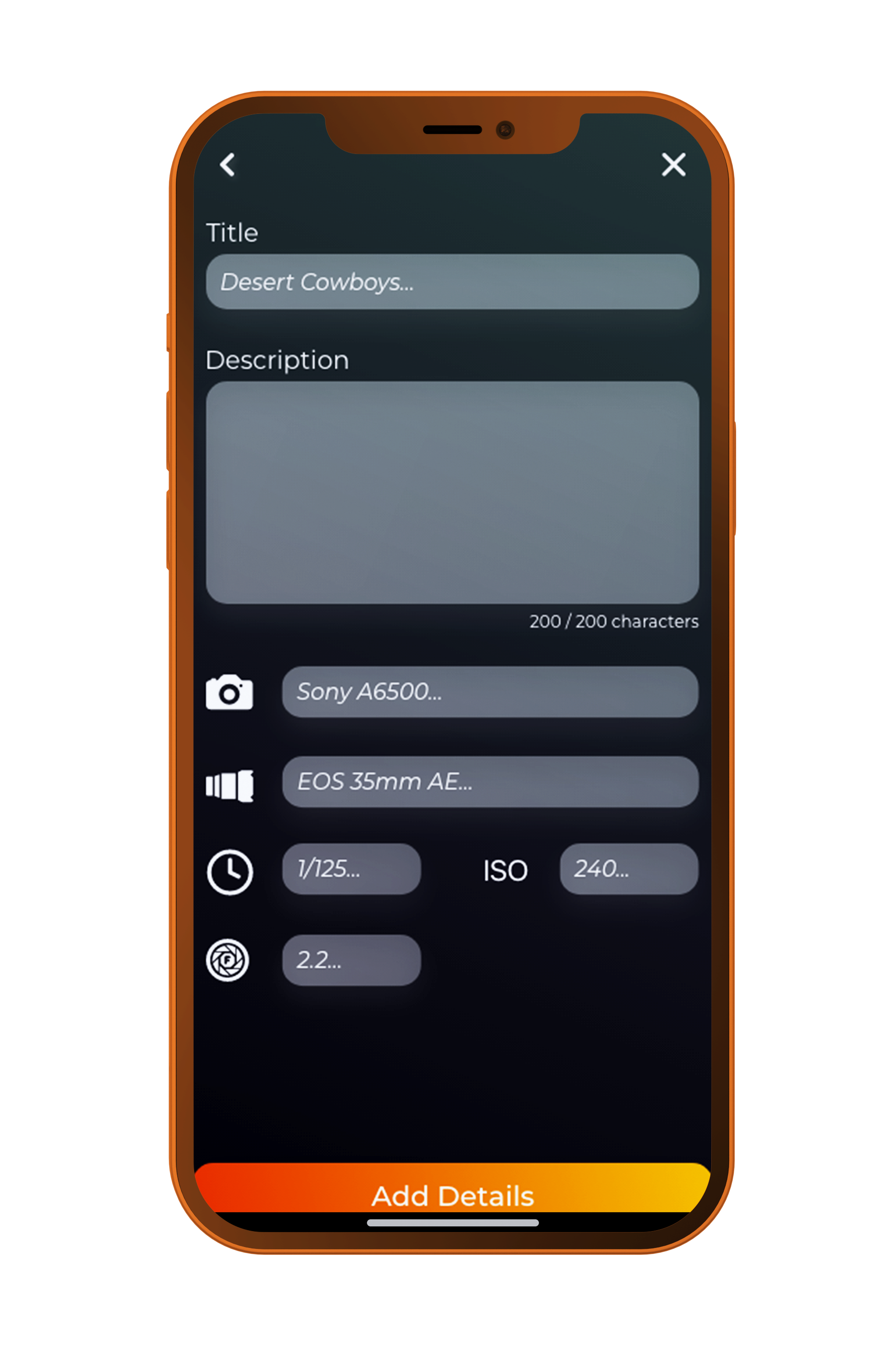
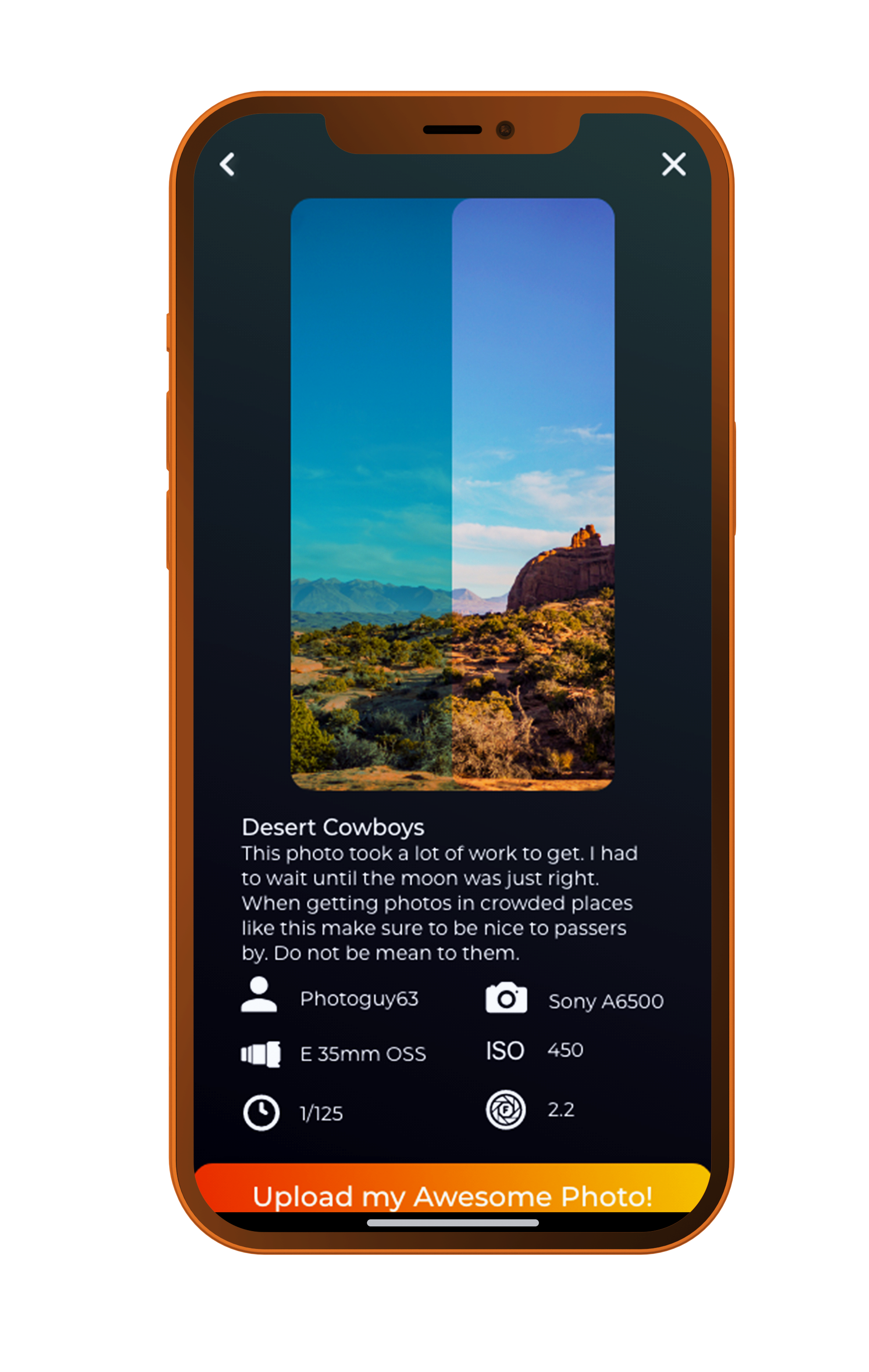
Presenting photo details with high priority educates novice photographers how to take incredible pictures.
Raw Filter
A quick toggle between the original photo and edited final further shows the process.
Photo Contests
Themed contests create additional activities for heavy users while keeping expert photographers engaged.
Branded Onboard Flow
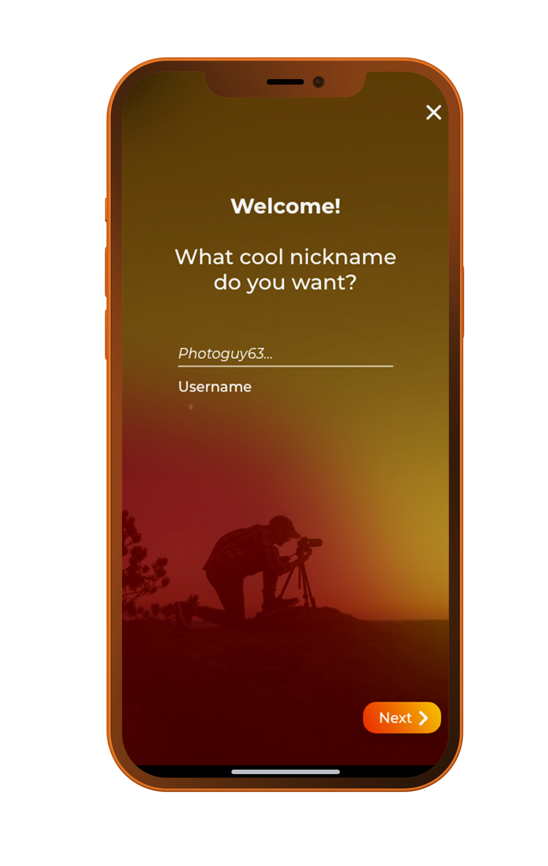
Placing strong brand aesthetic throughout onboarding flow ensures continual cognitive connection between users and app.
Approachable Copy
Education and novice comfortability were at the core of this product. It was essential that copy remained fun and non-intimidating.


